


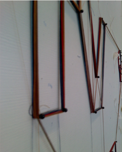
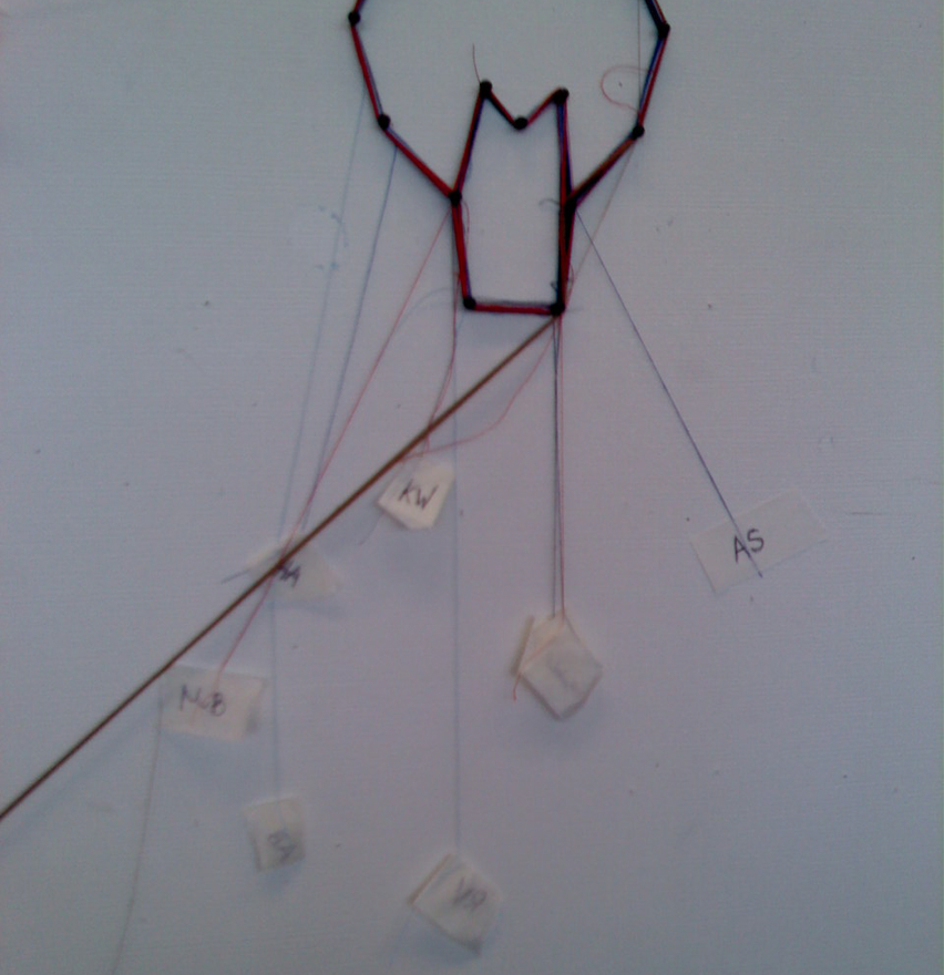
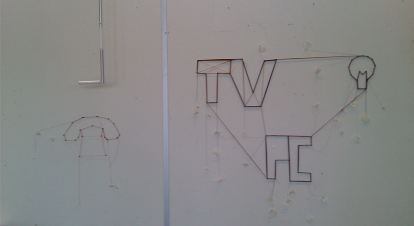
The aim of this workshop was to gain an understanding of data gathering, and how we could possibly display it in a functional format. As a group, everyone had to keep track of the energy consumption in their home for a 24 hour period. Once this had been completed, we were split into smaller groups and had to work out a way to display the data we had, using only pins and coloured string. My group had to display data for peoples' living/front rooms, and chose to only use data for the appliances that the majority, or all of us, used. At first we considered displaying the data by using a circle, with different sections representing different appliances. Each person in the group could have their own coloured string and create a line going from the centre of the circle out towards the edge. The longer the string was, the more hours the appliances were used for. However we noticed that the other groups were also displaying their data in circular formats so we scrapped this idea in favour of doing something a little bit different. We decided that we would create shapes representing the appliances, and each person would wrap their own coloured string around the shape the same number of times as the number of hours they used the appliance for. So if someone had the TV on for 8 hours, then they would wrap their string around the "TV" 8 times, and so on. We then personalised it by attaching small pieces of masking tape to the loose ends and writing our initials on each one. Although this was a unique way of displaying the data we had, it did have its limits. For example, the amount of data we were able to display was small compared to the data we had. We were only able to show the number of hours we used each appliance for, and couldn't include things such as energy consumption. We also weren't able to show the times in which we used them. With more materials I think it could've been developed further to include these, but in the short time we had to create it, and the lack of resources that were available to physically make it, it was inevitable that not all of the data was going to be included.
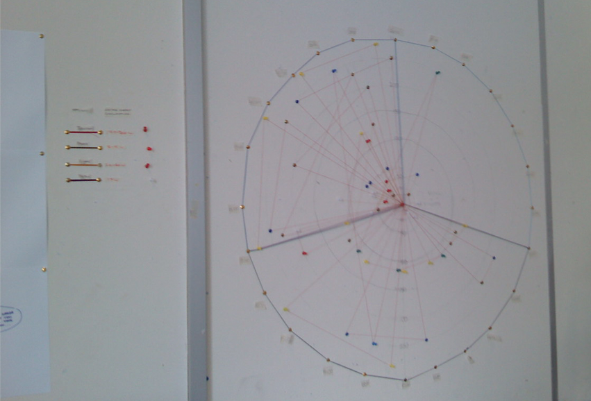
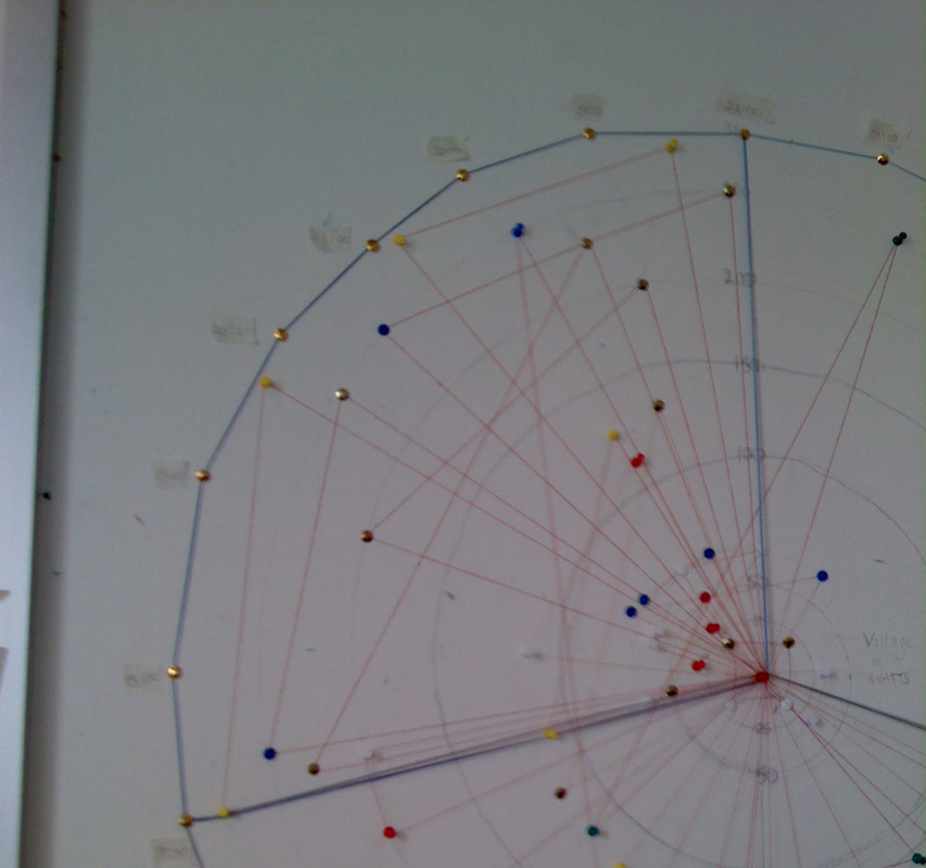
We then had the task of trying to improve another group's work. This chart displays the amount of energy used, and the time that it was used. It was quite a complex display, and we thought it'd be good to simplify it. The red string is the original group's work, while the blue outlines are what we added. We segmented the circle into three sections, each representing different average levels of energy consumption. When we looked at the circle, we could see that there were two distinct areas. The first was late at night and early morning, where little energy was used, and the other was late afternoon and evening when a lot more was. We split these two areas up, with a third area for late morning/early afternoon where energy consumption was neither high nor low. By using lighter coloured thread for low energy consumption and darker thread for higher energy consumption, we were able to break down the day into really basic segments showing when the least/most energy was used.